Nice suggestions, keep it up!
Official Anker Fan Swag Design Contest
The colors are "descreet.
As its for a technical company this a version I like.
Here’s my designs in 3 different variations. The first slogan is “take a charge on me” and is a play on words of the ABBA classic “take a chance on me” which I thought was quite clever… but then again I would say that. 
The second variation is like an homage to the “S” on Superman’s chest but with a bold “A” instead. The slogan on this one is “live fast, charge faster”
And the final variation is to show off our love for Anker with a simple “I heart Anker” design no catchy slogans on this one as I wanted to keep it simple.
I’m far from being any good at this sort of stuff but gave it my best shot with my limited knowledge and experience with designing things. I had fun bringing my ideas to life and that’s the important part. I hope that some of you like what I created here. 
I hope I’ll win with my design! 
Good luck to everyone!
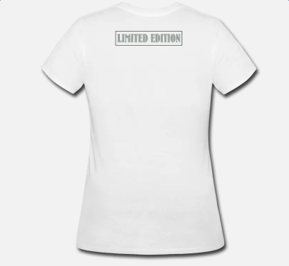
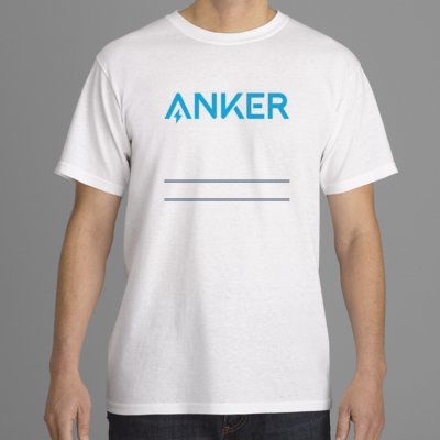
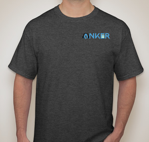
Here are the designs so far!
I do not have the skill to lay out a design, but I will provide the winning slogan, and share in the accolades.
“Get ANKERed.
Anything else will leave
you…anchored.”
(Include picture of anchor caught in muddy sea-bottom)
Thank you! Thank you! It’s been a pleasure to work with you.
Also if you’d prefer vector graphics then Inkscape is a free alternative to Adobe Illustrator. Works really well!
Love seeing these designs. Would love to buy one too since I’m just a peon in the community leveling system
It’s not showing the designs so far it’s only quoting what people have said 
Try right clicking on the image, click Copy Image Address, and then paste it in the dialogue box. It’ll display the image like it did below for me.  Then you may want to tag the designers and which number post it is.
Designs so far:
paulradetsky

TheCharneco


Quinn_Armstrong
Muhammad_02


Jerry_Rabinowitz

Raul_Alexandre

Macgyver15


Bogdan5

Hope I didn’t got anything wrong and sorry if I did.
I had to remove tags because I was getting error 500 when uploading
I like that:)
You should eliminate the background. BTW that was a similar idea I had in mind for one of my designs
That’s a cool and nice idea for the design 
I highly recommend Inkscape to everyone. It is open source and very easy to use. Oh, and did I mention it’s free!
Im slacking yet again, I had a few designs done but then page I was using went down and I had to start all over. Only managed to recover two of my pictures so far so here they are


If I had to choose between them @elmo41683 I’d definitely pick the first one.
It’s an awesome design and love the way the colours blend in together. 


